

Redecorating or renovating a home is an exciting endeavour, but amid the enthusiasm, it’s easy to make decorating mistakes while navigating layouts, paint swatches and budgets. While we’re often told to throw out the rule book and stay true to ourselves in our homes, there are still a few things you should definitely try to avoid.
Generic artwork
There’s something really cringe-worthy about seeing a print of a famous masterpiece, like the Mona Lisa or The Starry Night, that everyone knows is just a print, hanging in someone’s home. Although both are beautiful pieces of art, a copycat print ends up looking like a ‘filler’ piece. Same with slogan artwork. It takes no risks, reflects zero personality, and provokes no feeling.
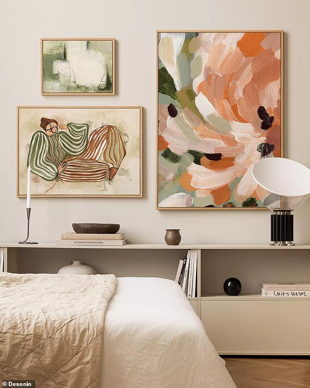
Generic artwork reflects zero personality
In contrast, a painting you found in a second-hand shop, on holiday, or inherited from a family member feels curated, interesting, and personal. If you’re in a hurry to complete a gallery wall, however, I recommend Etsy, eBay, and East Side Studio London for artwork that breaks from the norm without breaking the bank.
Bouclé
Bouclé, once associated with elegance, has now become the default upholstery choice, covering sofas, rugs, and just about everything else. It’s featured in the shop windows of every mass-produced high street store from Regent Street to Shoreditch. Yes, I know it looks great when it’s pristine white. But how will it look in a year’s time, when that bright sparkle has dulled to off-white? Or worse, grey.
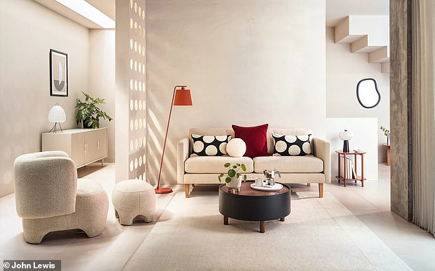
Opt for textures that aren’t quite so hyped as bouclé
When investing in upholstery, it’s a much safer bet to opt for textures that aren’t quite so hyped. Think cotton or brushed linen-they look and feel fresh, and they age far better. For those still set on bouclé, try chenille instead. It has all the softness and texture of bouclé but is lower-risk, thanks to the wide range of colours and patterns available. Oh, and it doesn’t scream 2020.
Putting the product before the measuring tape
We’ve all done it: fallen in love with a dream sofa, brought it home, and realised it either doesn’t fit through the front door (I know someone who had to remove their front windows to get the sofa inside) or that it completely dominates the room, making the space feel like a postage stamp. Likewise, buying items that are way too small for the space: hello, rug that looks more like a doormat once you get it home.
This simple mistake is easily avoided by measuring your space at least twice before you go shopping. Once you find the item you want, get the measuring tape out again. Don’t rely on web guides or guess-timations.
Once you’re home, mark out the item’s dimensions using masking tape so you can visualise how much space it will actually take up before you buy.
Apply this technique to everything: rugs, mirrors, artwork-the works. A good rule of thumb? The more important the item (think fitted kitchen or new bath), the more times you should double-check your measurements. Nobody wants to end up with costly mistakes down the line.
Over-decorating
A patterned rug, statement artwork, scallop cushions, and a gilded mirror, you say? That’s too much.
Homes that use décor to tell a story are wonderful, but there’s a difference between curating your items and simply having too much stuff. A major sign of over-decorating? When you can’t focus on any one piece in the room.
Every room needs negative space (areas with nothing in them) to give the eye a chance to rest and to allow key elements like a mirror, sofa, or TV area to stand out. Without it, you risk overstimulating yourself and your guests.
When it comes to pattern, the key is to play with shape and scale. Mix one large-scale pattern with a medium-scale and a small-scale design, then balance it all out with plain fabrics or solid colours. This prevents patterns from competing with each other, and your room from feeling chaotic.
Leaving lighting to last
Paint? Tick. Flooring? Tick. Furniture? Tick. Lighting…? Uh-oh.
One of the most common mistakes I come across when styling people’s homes is how often lighting is underestimated despite the huge impact it has on how a space looks, feels, and functions.
You want to avoid lighting that feels more interrogation than invitation, so think about what the room will be used for. Is it for working, relaxing, or dining? That will help determine the atmosphere and mood you’re aiming to create.

Lighting has a huge impact on how a space looks, feels and functions
For task-focused activities-like cooking in the kitchen or reading in the living room-you’ll need strong task lighting to create defined pools of brightness where you need it most.
If the space is mainly used for relaxing, decorative lighting-such as table lamps and wall sconces-will add a soft, welcoming glow and create visual interest. Personally, I’m very partial to a statement (preferably oversized) pendant light above a dining table, or a large table lamp on a side table, to bring warmth and style when entertaining friends and family.
Smart tech
‘It’ll save you time,’ they said. ‘It’ll look great,’ they said. What they didn’t say was that smart tech often comes with a lot of troubleshooting, a stack of confusing instructions, and soulless design.
Smart tech often comes with a lot of troubleshooting
And let’s be honest, tech is only good for as long as it works… or until something newer and shinier comes along, instantly making your home feel dated. Often, it’s more trouble (and expense) than it’s worth. If you love having smart appliances in your home, stick to tabletop devices, like speakers or TV screens, that can be upgraded or swapped out more easily as technology evolves.
Buying paint based on a screen grab
Just because you love the way a paint colour looks on screen or on a sample card doesn’t mean it will translate well onto your walls.
Always remember to order a tester pot or sticky swatch and observe it at different times of day to see how the colour changes in various lights. As a general rule, soft pale tones work well in south-facing rooms because they maximise the feeling of light and space-think pale blues, putty pinks, and oatmeal.
Don’t buy paint based on a screen grab
Cosier, warmer shades such as ochres and corals work best in north-facing rooms, which receive less natural light and tend to feel cooler. Also, consider the size of your room: I once helped an ex-boyfriend slather the walls of a compact room in black paint-including the ceiling. It felt like the walls were closing in. Needless to say, that relationship didn’t last.
Ignore tester pots at your peril.


![Martine McCutcheon 's estranged mother Jenny Tomlin has emotionally reached out to the star to beg for a reconciliation after having cut her off following the tragic death of her son [Martine and Jenny pictured in 2006]](https://www.americanpolibeat.com/wp-content/uploads/2025/07/Martine-McCutcheons-estranged-mother-emotionally-reaches-out-to-beg-for-350x250.jpeg)


