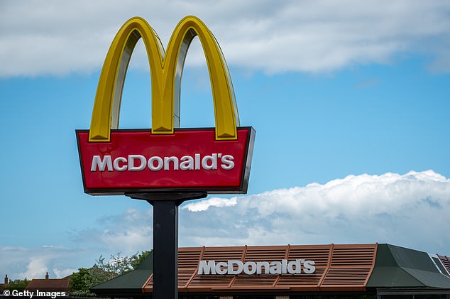
When most people pull up under the double aches to order salty fries and a Big Mac, they aren’t thinking about the bold red and yellow color scheme of the iconic restaurant, but it does mean something.
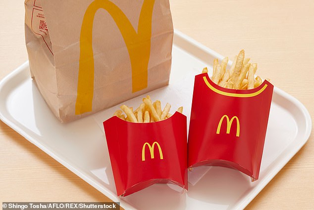
It’s printed on everything – the bag, the French fry boxes, even on the ice cream wrapper that sticks to your cone. So why exactly did the fast-food chain choose these two clashing colors?
Well, it’s a mind trick… literally!
‘Red triggers stimulation, appetite, hunger; it attracts attention,’ color psychologist Karen Haller told The Mirror. ‘Yellow triggers the feelings of happiness and friendliness.’
She went on to say that the color combination psychologically indicates to the brain ideas of ‘speed’ and ‘quickness.’
‘In, eat, and out again,’ she told The Mirror.
The yellow has a double function; the bright color naturally draws attention and can be easily spotted from the road.
Also, the yellow arches resemble one of its most popular menu items: fries.

When most people pull up under the double aches to order salty fries and a Big Mac, they aren’t thinking about the obnoxious color scheme of the iconic restaurant, but it does mean something

‘Red triggers stimulation, appetite, hunger; it attracts attention,’ color psychologist Karen Haller told The Mirror . ‘Yellow triggers the feelings of happiness and friendliness’
And pair the arch with its red base, the resulting combo looks like their famous box of fries.
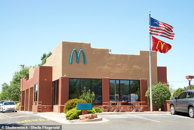
There are only a few places where the McDonald’s logo isn’t yellow and red, and you’d have to drive to Arizona to find one of them.
A store in Sedona instead has a unique set of teal colored arches on its exterior.
The Sedona location, located off State Route 89A, isn’t the only McDonald’s in the world that deviates from the classic yellow symbol, but this one has a good reason.
The burger joint location was built in 1993 – just a few years after Sedona was incorporated into Arizona.
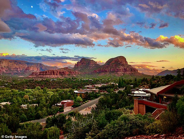
After the Department of Community Development settled into its role, it decided it was unhappy with the bright gold against Sedona’s muted natural red rock beauty.
‘Someone suggested it would be interesting if they did something else than golden arches to fit in with the identity that the city decided to establish,’ senior planner for the department, Cari Meyer, told ABC 15 in 2022.
The city government pushed McDonald’s to switch to teal to avoid clashing with Sedona’s breathtaking background.

Haller went on to say that the color combination psychologically indicates to the brain ideas of ‘speed’ and ‘quickness’

There are only a few places where the McDonald’s logo isn’t yellow and red, and you’d have to drive to Arizona to find one of them. A store in Sedona instead has a unique set of teal colored arches on its exterior

After the Department of Community Development settled into its role, it decided it was unhappy with the bright gold against Sedona’s muted natural red rock beauty (pictured: Sedona)
Surprisingly enough, the fast-food chain agreed, making it the only store with this unique color scheme.
Regardless of the color, their fries and burgers and oft-broken ice cream machine will always draw customers in.


