
SALFORD CITY have unveiled plans to change the club’s badge – but not all fans agree on the decision.
The switch from their current one, a minimalist black and white lion design on an unusual hexagon crest, has stirred debate.
Going forward the League Two side will have a more traditional lion on a circular crest, with the club name featuring.
It was designed in conjunction with renowned New York based design agency MILK.
Although 72 per cent voted in favour of changing the club’s badge, those who voted the other way have made their voices heard across social media.
One Facebook user said: “Should have just kept the old badge and changed the red to orange.”

While another wrote: “Prefer the current badge.”
News about the new club badge was also posted on Instagram, and in the comments one said: “Club colours is a good idea, badge isn’t, it was iconic.”
Another user claimed: “Step backwards for me that.”
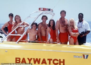
It comes after fans also voted to change the colours of the kit from red and white to orange and black in October.
BEST ONLINE CASINOS – TOP SITES IN THE UK
Until 1990, Salford City were known as Salford Ammies and they played in orange.
Their old badge had a silver-plated logo in the centre accompanied by the symbol of a lion.
Outside of that, it was predominantly orange with black writing.
The club’s name was written on the outside, and below the badge it read ‘The Ammies’ – which is still Salford’s nickname today.
The new crest appears to follow the trend of the kit, reverting back to club tradition.
But instead of the lion facing left, it is now facing the right to symbolise ‘looking forward’ rather than back.
The font of the badge is inspired by famous Salford band New Order, and symbols of famous landmarks Salford Lads Club and the Gasworks are also represented – as stated by the club website.
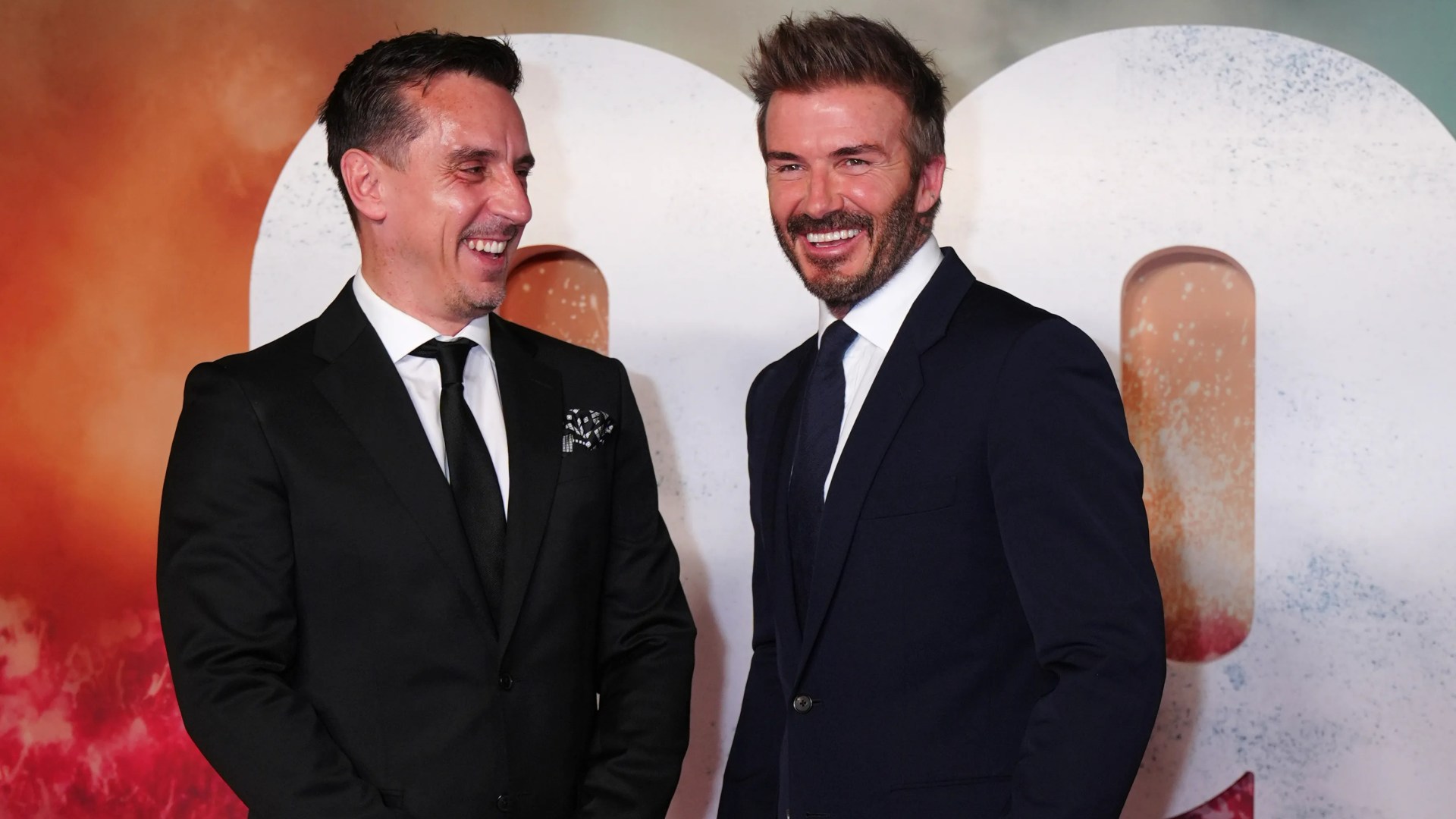
The Class of ’92 purchased shares in Salford in 2014, and between then and 2019 the club achieved four promotions in five years – climbing from the Northern Premier Division North to League Two.
Gary Neville and Sir David Beckham still serve as co-owners, along with American businessmen Declan Kelly and Lord Mervyn Davies.
Beckham is also co-owner of Inter Miami, who recently won the MLS Cup inspired by Lionel Messi.
Karl Robinson’s side are currently sixth and are targeting promotion to League One this term.
Should they achieve it, it will mark two new beginnings.
The club will be hoping to don their new badge as a third tier side for the first time ever.