
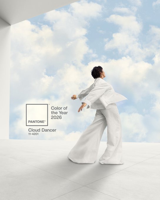
THE word is out, the Pantone Colour of the Year 2026 is… Cloud Dancer.
Far from the predicted teal, this shade is named as a weightless white that signals calm and clarity, but after the shade was announced some interior fans slammed the choice as ‘boring’.
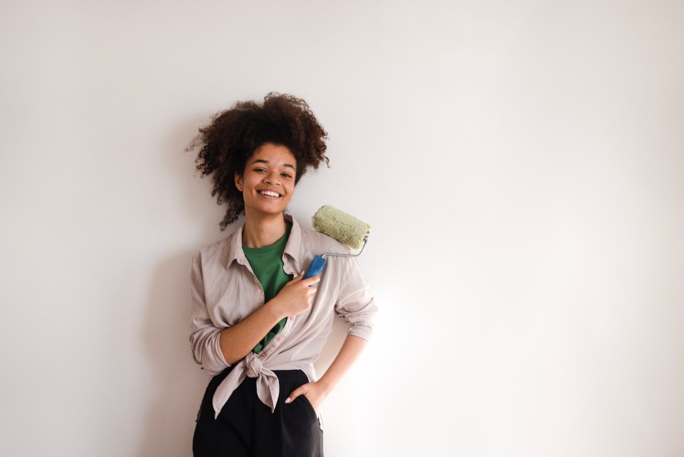
It might not quite rock your world, but the subtle and calming colour choice is actually a great once, at least according to Johanna Constantinou, interior trends expert at Tapi Carpets and Floors.
She shared her thoughts on the choice and how anyone can incorporate it into their home as we head into 2026.
“Cloud Dancer arrives as one of Pantone’s most surprising Colour of the Year choices to date, a soft, almost weightless white that stands out precisely because of its simplicity.
“At a time when many expected richer, moodier hues, Cloud Dancer instead signals a shift toward clarity, calm and quiet refinement.
READ MORE ON INTERIOR DESIGN

“Its gentle undertone gives it a warm feel rather than a stark or clinical one, making it a versatile neutral for modern homes.”
Despite the unexpected choice not being an immediate fan favourite, the interior whizz explained how it’s great for creating a relaxing space.
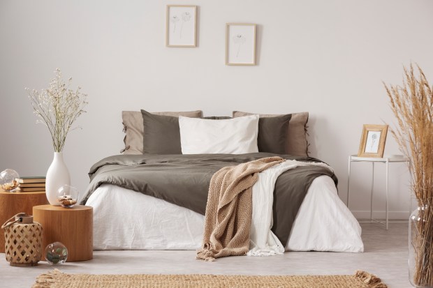
Rather than the maximalist approach, the subdued colour encourages “a more curated approach, one where a few meaningful pieces replace heavy layering,” the pro said.
It’s also great for smaller spaces, since the light and bright colour can open them up.
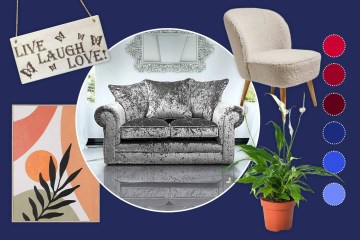
Pair it with warm neutrals, soft greys or muted greens keeps the palette from feeling too stark, the interior designer encouraged.
She continued: “Additionally, Cloud Dancer’s strength lies in its ability to sit quietly at the heart of a variety of distinct moods, from soft and dreamy to vibrant and unexpected.”
It can be used In the pink palette for barely-there backdrop for airy pinks, pale lavenders and gentle yellows – perfect for a romantic feel.
It can also be paired with subtle blues, aqua-greens and greys to conjure a sense of spaciousness and calm, like a gentle skyscape inside your home.
Or for someone be earthy, the pro suggested mixing in warm taupes, soft browns or muted organic shades paired with this soft white create calm rooms.
Interior Design expert advice