

Ministers spent more than £500,000 of taxpayers’ money on a ‘vanity’ makeover for the government website which critics say is little more than changing a colour and moving a dot.
The gov.uk site, used by millions for essential services such as tax returns and passport renewals, will see its traditional black masthead turned blue and its ‘dot’ coloured turquoise.
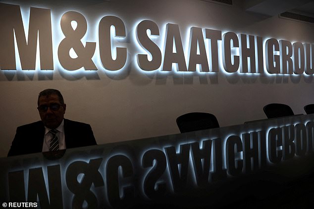
The tweaks were commissioned as part of ‘brand refresh’ with contracts totalling £532,000 handed to global ad agency M&C Saatchi.
The costly new logo, set to go live this month, has already met with ridicule from civil servants, with one mocking online: ‘Did someone really get paid to move a dot?’.
Others labelled it ‘cheap’, ‘tacky’ and ‘absolutely diabolical’.
Zia Yusuf, head of Reform UK’s efficiency drive, last night branded the revamp a waste of public money.
He said: ‘The disrespect for taxpayers’ money continues to be astounding.
‘Spending more than £500,000 on changing a logo on a government website is a joke at the taxpayer’s expense, quite literally.

The old logo of the Gov.uk website has been updated as part of an updated website at a cost of more than £500,000

The new logo sees its traditional black masthead turned blue and its ‘dot’ coloured turquoise
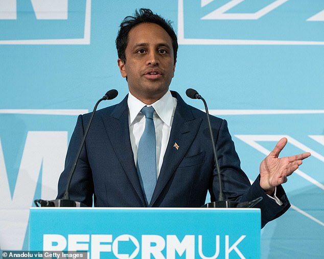
Zia Yusuf, head of Reform UK’s efficiency drive, said: ‘The disrespect for taxpayers’ money continues to be astounding’
‘This is just the kind of thing we have been uncovering in county halls on a daily basis. It’s abundantly clear that Whitehall also needs a visit from Reform’s DOGE team.’
Two contracts for the brand refresh were tendered by the previous Conservative government and carried on under Labour, according to publicly available papers.
Communications giant M&C Saatchi secured deals potentially worth up to £750,000.
A government source said the final bill came to £532,000, which the cost drawn from existing department budgets.
The new logo was criticised on web forums used by civil servants.
One said: ‘As a government we are trying to maximise efficiency and save money.
‘Why was this what we chose to spend time and resources on?’
Another joked: ‘Reform blue for the dot. Conservative blue for the background. Are they preparing us for 2029?’
Elliot Keck, campaigns chief at the TaxPayers’ Alliance, said: ‘Taxpayers will be baffled that hundreds of thousands have been blown on minor graphic design changes.
The tweaks were commissioned as part of ‘brand refresh’ with contracts totalling £532,000 handed to global ad agency M&C Saatchi
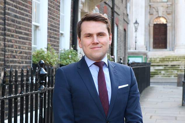
Elliot Keck, campaigns chief at the TaxPayers’ Alliance, said: ‘Taxpayers will be baffled that hundreds of thousands have been blown on minor graphic design changes’
‘At a time when public services are stretched and families are feeling the pinch, shelling out for a vanity rebrand is an insult to hardworking Brits.
‘Ministers should be focusing on delivering frontline services, not petty optics.’
Officials defended the cost, stressing the six-figure bill included ‘refreshing and extending’ the Gov.UK brand across web, mobile and app platforms.
A government spokesman said: ‘This was committed to by the previous government, with two of the three contracts signed and delivered by July 2024.
‘The new government then chose to turn the rebranding and research work into consumer-friendly digital products, including our upcoming gov.uk App, gov.uk Chat and more.’
MailOnline has contacted the government for further comment.
The gov.uk website was last overhauled in 2012.
Last year the logo was tweaked to incorporate the chosen Tudor Crown of King Charles, replacing the St Edward’s Crown cypher used by the late Queen.


